home ~ socials ~ projects ~ rss

A Centered Responsive Image With Matte And Border

October 2022

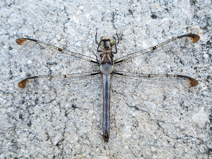
I've been searching for CSS to display images in a gallery style. Ones with a black pen line border on a white matte style background. More importantly, I want them designed so that when they are centered in the viewport 100% of both the image and the matte are visible.

I've taken a few different runs at it and finally got to this:

CSS

*,
*::before,
*::after { box-sizing: border-box; }

* { margin: 0; }

.matteWrapper {
  display: grid;
  place-items: center;
  margin-block: 3rem 4rem;
}

.matteWrapper img {
  background-color: black;
  padding: 2px;
  border-top: 10vmin solid white;
  border-left: 10vmin solid white;
  border-right: 10vmin solid white;
  border-bottom: 12vmin solid white;
  max-height: min(94vh, 98vb);
  max-width: min(94vw, 98vi, 100%);
}

Here's a couple of examples followed by the code. Resize your browser a bunch to see the behavior.

A black and white photo of a man with a dower look staring at the camera holding an ornate sword
A dead dragonfly laying upside down on the sidewalk

I'm still a yellow belt when it comes to CSS, but as far as I can tell this is doing everything I want.

end of line
Share link:
https://www.alanwsmith.com/en/2g/ch/ep/y7/?a-centered-responsive-image-with-matte-and-border