Stack Overflow's Design Change is Not For Me
Got a note that this is part of an experiment
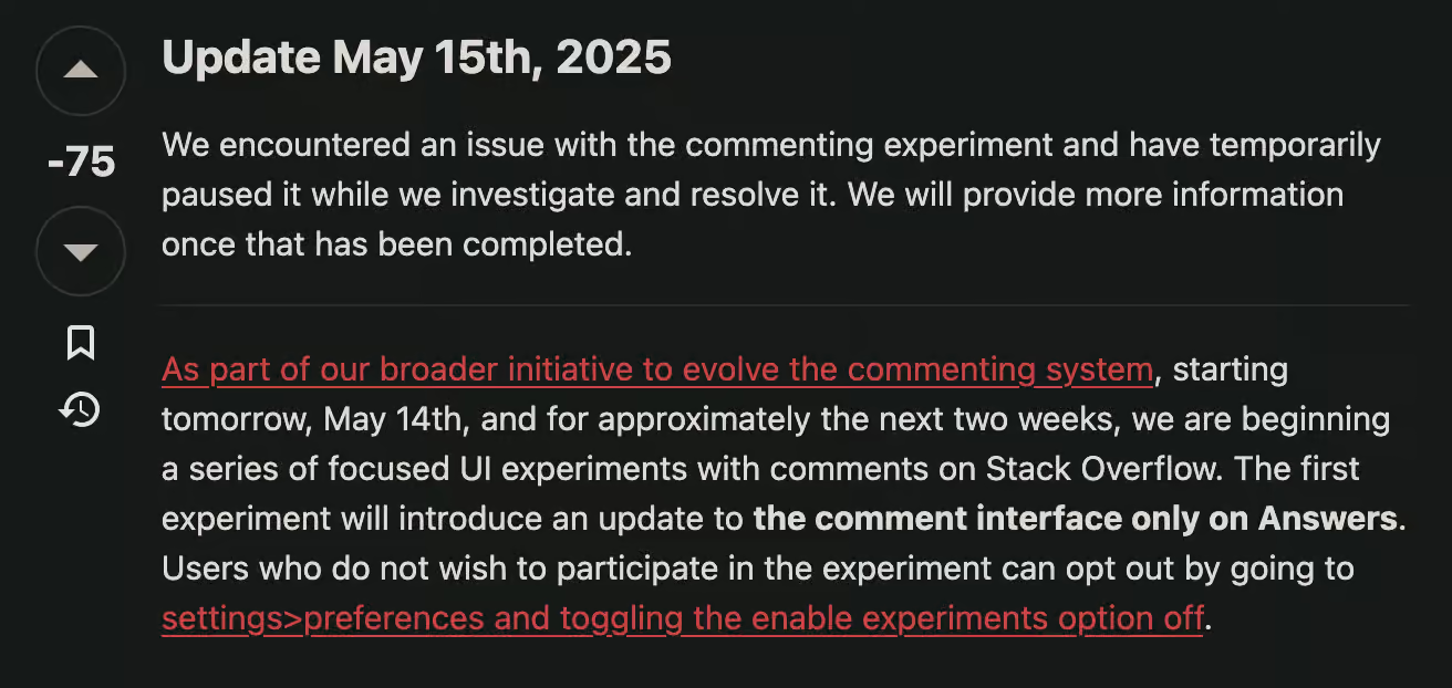
Judging by the negative 75, I'm guessing I'm not alone in my dislike for the changes. I posted a link to this post over there as my comment.
Something Changed...
I hit Stack Overflow1 this morning. Comments looked different. The site probably makes design changes all the time that go unnoticed. This one added avatars. It's glaring.
How It Started...
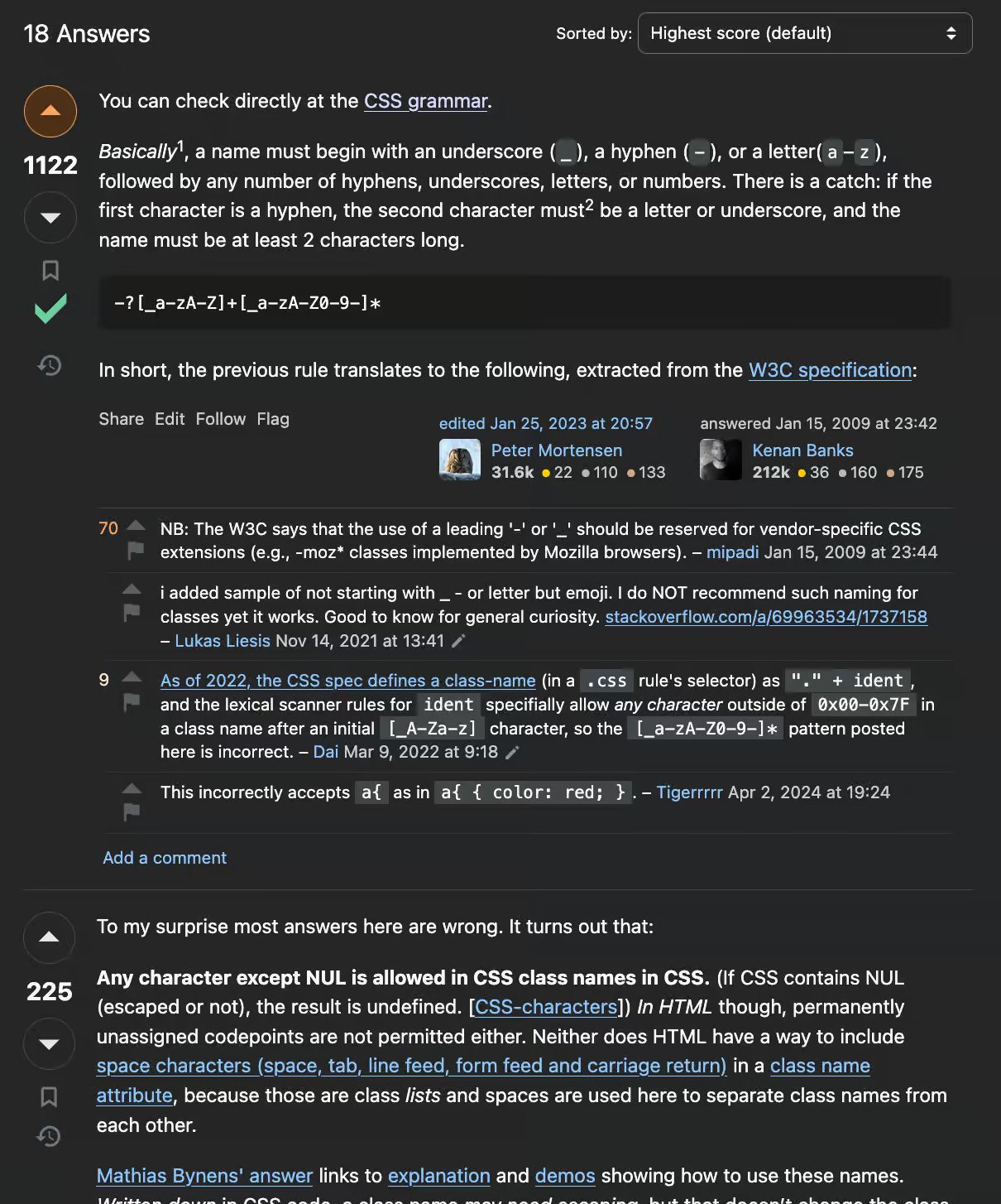
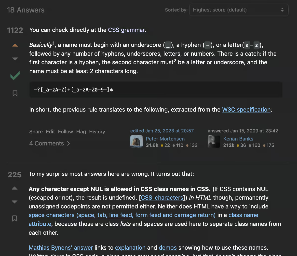
It's rare to be able to do a side by side comparison2 of a design change. Best chance is if you have a tab open to a page with the old design. Which is exactly what I had. Here's the view from last night3:
How It's Going...
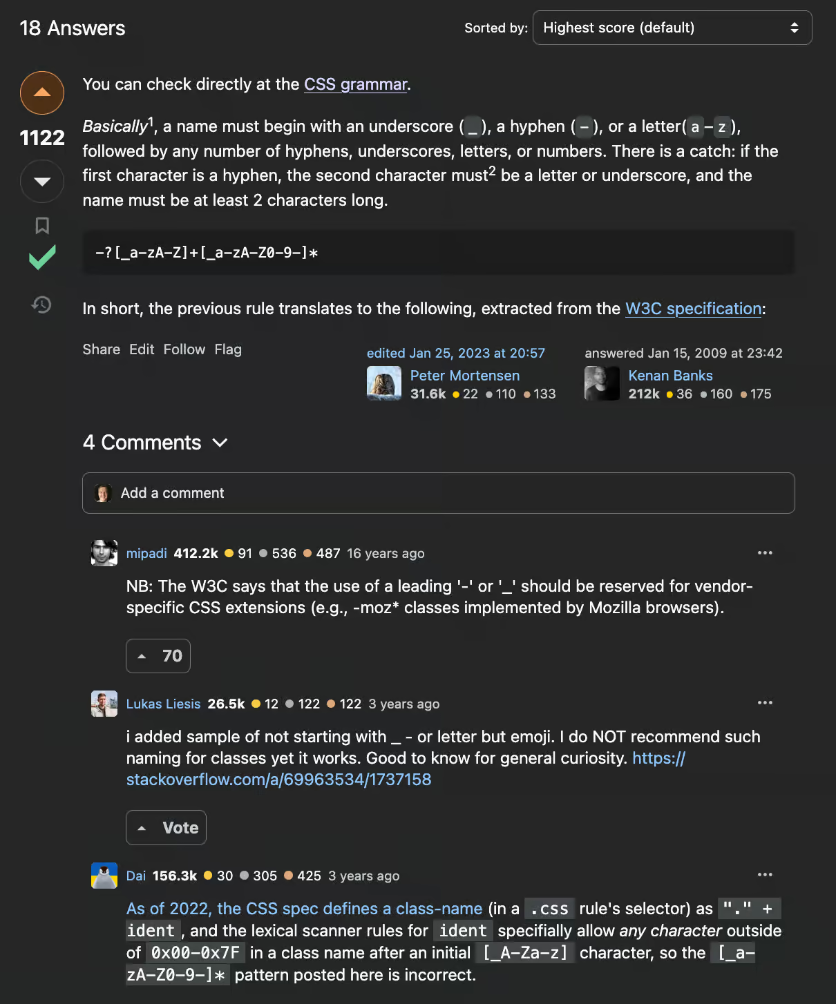
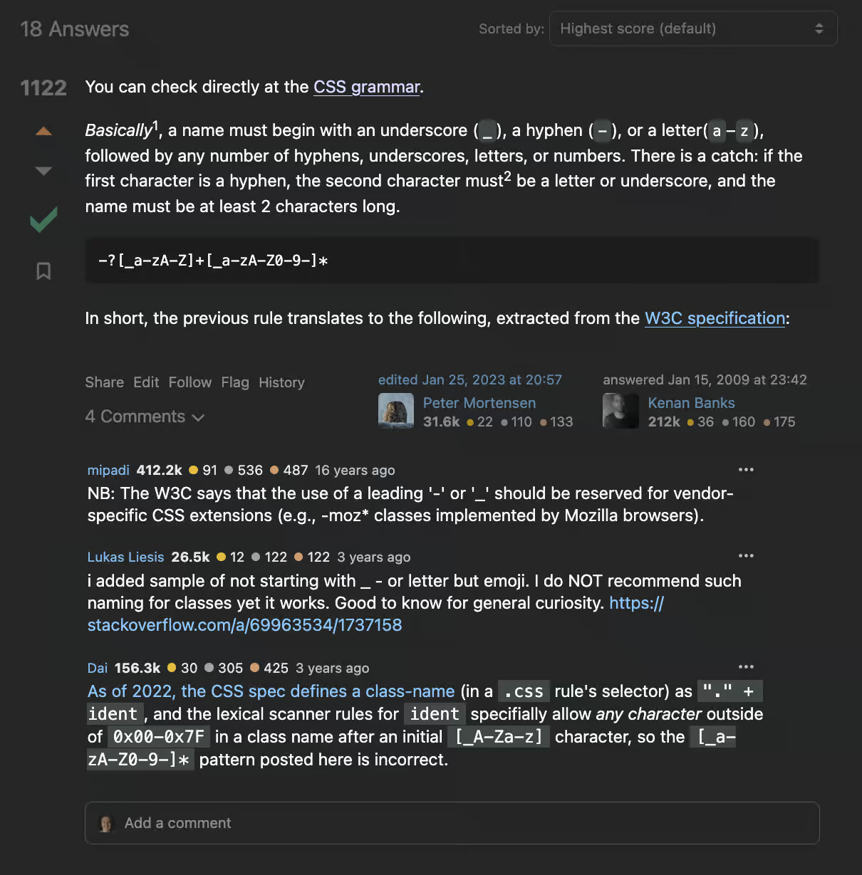
Here it is after I hit refresh:
What Am I Looking At?
There's science behind what draws the eye4. Faces are a huge pull. My eyes skip past the answer. They go straight to the comment avatars. That's a detriment. I'm on the site for answers. Not commentary5.
Related Notes
- The vertical height of each comment is way bigger6. Other answers get pushed further down7. As before, my primary goal is getting an answer. Making me scroll more to see them is a negative.
- Putting the "Add a comment" bar above the comments encourages me to write something before reading what's already there.
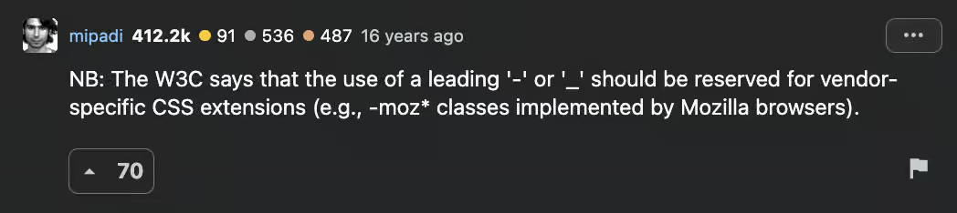
- The "Vote" button is huge. The font is the same size as the comment text. With the border and separation from the rest of the comment, it's visual weight is a heavier pull than the text in the answer. It might even be strong than the avatars.
-
You have to hover over the answer to see the icon to flag a comment.
TBD on flagging on devices without mice8. It might not be discoverable at all.
- The three dots in the upper right open a dialog with a single "Copy Link" button. Feels weird to only have one thing there9.
Not All Bad
There are some nice things though:
- The comment text is bigger. Making the comments easy to read when I get to them is a plus.
- The "Add a comment" box is nicer than having to click a link. The positioning above the existing comments is what bugs me.
- I suppose being able to collapse comments is a nice thing. I don't expect to use it much. If anything, I'd rather the comments be closed by default. I'd rather review the answers first then open comments manually for the one that's most appealing.
Triggering Designers
I'm not sure if Photoshopping a designer's work is the best way to piss them off. If not, it's top five. Maybe top three.
Unfortunately, the "picture is worth a thousand words" thing is true. I don't have time to write a treatise on what I'd like to see. So...
It comes down to two things:
- De-emphasize everything that's not answer content
- Close comments by default
My eye goes straight to the first answer. Comments are there if I want them, but they don't get in the way of the next answer.
Comment Commentary
I suppose I should end with comments since that's where this all started. Here's what I'm thinking: drop voting behind the ... menu, remove the avatars, and put the "Add a comment" box at the end10.
Sample Size Of One
Designing a corporate website is a tricky dance. Balancing input from groups and managers with differing opinions while trying to meet strategic goals is no easy task. Ideally, design decisions are based off research that informs the direction.
It might be the original design updates nails everything possible. That I'm an outlier. I can only know what's in my head, but I know the decisions they made make it harder for me to accomplish my primary goal. To find answers.
-a
Footnotes
The go-to website for finding answers to programming questions. Hopefully, it doesn't get overrun by AI slop.
Or, over/under in this case.
I clipped out a few paragraphs from the answer to make the images shorter. The original is here if you're interested.
I don't have the spoons to grab links to the research right now.
Sure, the comments can be useful. Regardless, they aren't the reason I come to the site.
The second comment goes from 108 pixels tall to 176 by my measurement.
The second answer got pushed completely off the page in this example.
Think phones and tablets. I don't know enough about how screen readers work to have a meaningful comment on them.
That hard to discover flag feature would be a natural fit.
I didn't mean to remove vote counts completely. Just forgot about them. If I was going to do it again, I'd put them at the end of the byline (e.g. after the "16 years ago")